When discussing “data visualisations,” we’re referring to the graphical representation of data and information. If executed effectively, good visualisation techniques successfully remove the noise, making pertinent information more prominent.
These visualisations play an important role in facilitating understanding, analysis and communication of insights. They transform raw data into visual formats, such as charts, graphs, diagrams, and maps, simplifying the comprehension of complex datasets.
In today’s data-driven world, organisations are inundated with vast amounts of data, and navigating through all this information poses a significant challenge. Amidst this flood of data, effectively communicating insights to key stakeholders becomes paramount.
Below, we explore the aspects of visualisations that assist in conveying messages to stakeholders.
Enhanced Understanding: Data visualisations offer a clear and concise representation of data, enabling stakeholders to grasp complex concepts quickly and intuitively. Whether deciphering trends, identifying patterns, or exploring correlations, visualisations bring data to life, making it accessible and understandable for technical and non-technical audiences. Through charts, graphs, maps, and dashboards, stakeholders can gain insights at a glance, leading to faster comprehension and more informed decisions.
Effective Communication: Visualisations serve as a universal language that transcends barriers of language and expertise. They enable stakeholders to communicate ideas, trends, and insights compellingly and engagingly. Whether presenting financial performance metrics to investors, tracking operational KPIs with executives, or sharing market trends with marketing teams, Visualisations facilitate effective communication by conveying information in a format that resonates with diverse audiences.
Data-Driven Decision-Making: In today’s fast-paced business environment, data-driven decision-making is imperative for success. Visualisations empower stakeholders to make informed decisions based on real-time insights derived from data. By visualising key metrics, trends, and outliers (a data point significantly different from the dataset), decision-makers can identify opportunities, detect potential risks, and formulate strategies with greater confidence and precision. Whether optimising processes, allocating resources, or forecasting future trends, data visualisations are critical for driving business outcomes.
Increased Engagement: Visualisations have the power to captivate and engage stakeholders in ways that traditional data reports cannot. By incorporating interactive elements such as drill-down capabilities, filters, and animations, visualisations encourage stakeholders to explore data dynamically and derive insights at their own pace. This interactivity fosters deeper engagement, encourages exploration, and promotes a culture of data-driven inquiry within organisations.
Building Trust and Alignment: Visualisations foster transparency and alignment by providing stakeholders with a shared understanding of data and insights. By presenting information in a visually compelling and accessible format, organisations can build trust, foster collaboration, and promote alignment among stakeholders with diverse perspectives and priorities. Whether aligning teams around common goals, communicating progress towards objectives, or sharing performance metrics with stakeholders, Visualisations help build a culture of transparency and accountability.
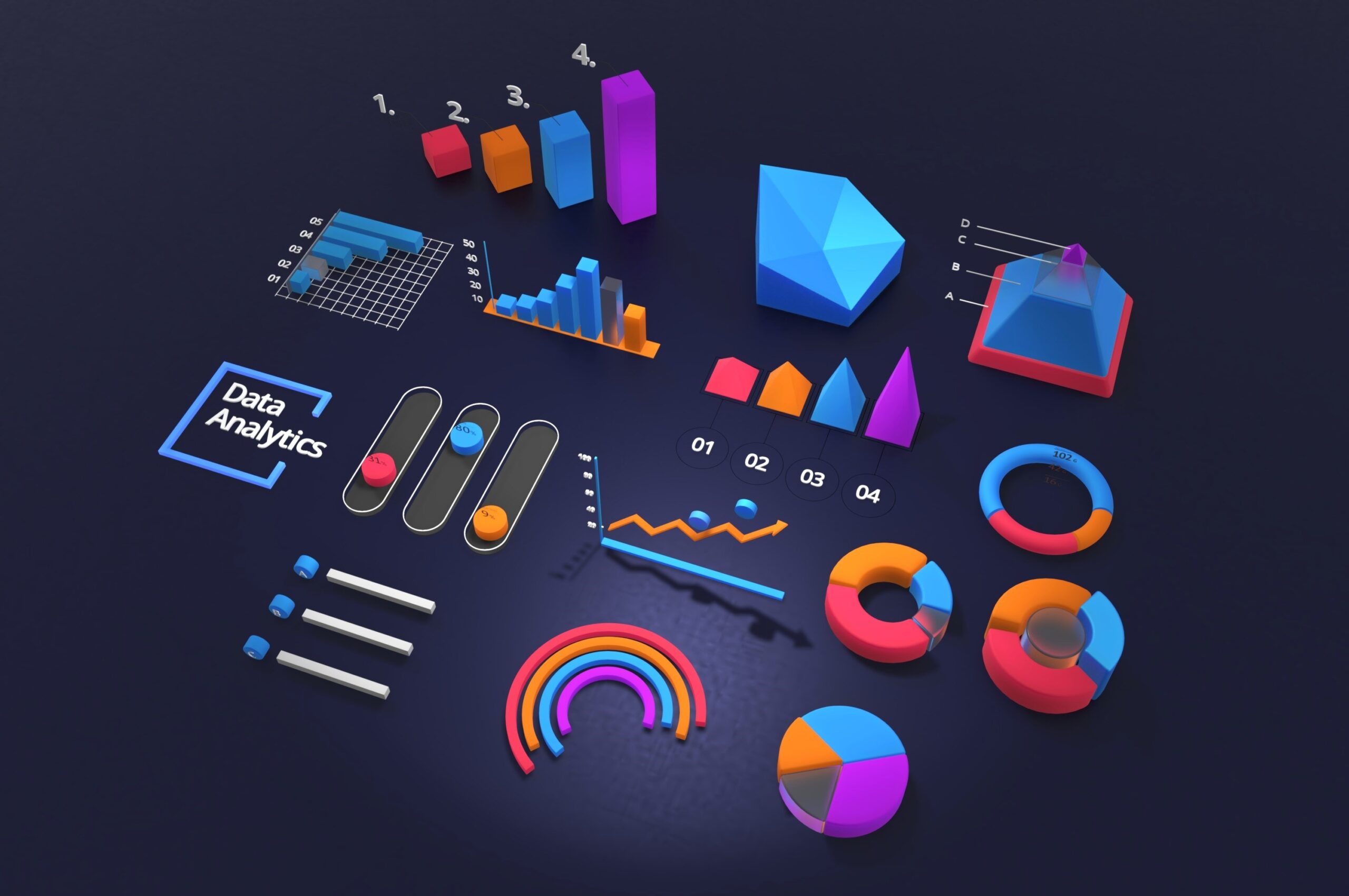
Exploring Data Visualisations
Let’s explore the various types of data visualisations and how each uniquely clarifies data-driven stories. From bar charts for comparing across categories to treemaps for navigating hierarchical structures, each visualisation type offers distinct advantages in conveying insights effectively.
Bar Chart: Comparing Across Categories: Bar charts serve as the cornerstone of visual comparisons, allowing stakeholders to gain insights into categorical data effortlessly. Whether illustrating sales figures across different regions or tracking monthly expenditures, the bar chart’s simplicity and clarity facilitate quick comprehension of comparative data.
Line Chart: Tracking Trends Over Time: The line chart emerges as a dependable friend when illustrating chronological trends or establishing connections between variables. Its dynamic representation of data points over time enables stakeholders to identify patterns, forecast trends, and make informed decisions based on historical data.
Pie Chart: Illuminating Proportions and Percentages: The pie chart is unmatched for portraying the composition of a whole or highlighting proportions within a dataset. Its easy-to-understand circular design divides complicated information into simple sections, making it perfect for showing market shares, budget breakdowns, or population distributions.
Scatter Plot: Unveiling Relationships Between Variables When we want to understand relationships between variables, the scatter plot proves invaluable. It visually represents data points on a graph, facilitating identifying connections and outliers. These insights enhance our understanding of the data, empowering us to make informed decisions.
Heat Map: Illuminating Spatial Patterns When dealing with maps or geographic information, the heat map is invaluable. It uses assorted colours to highlight patterns, concentrations, and anomalies. Whether analysing population densities, website traffic, or climate variations, the heat map makes it easier to understand patterns by using colours to grab our attention and explain the dataset.
Box Plot: Unveiling Distribution and Variability: In data analysis, the box plot is vital for uncovering the distribution and variability within datasets. By visually displaying key statistical measures such as the median and outliers, the box plot offers valuable insights into the spread and central tendency of the data.
Area Chart: Tracking Cumulative Trends: When tracking how things add up or change over time, the area chart is perfect for showing colourful trends and changes. The area chart brings data to life, uniquely portraying cumulative trends.
Tree Map: Navigating Hierarchical Structures When understanding complex data with many layers or levels, the tree map is like having a treasure map for information. Instead of seeing numbers or lists, the tree map shows data as rectangles nested within each other. Each rectangle represents a different part of the data, and its size shows how important or big that part is. With a tree map, you can easily explore how things are organised and find patterns that might not be obvious at first glance.
Key Features for Effective Visualisations
When creating charts for data visualisation, it’s crucial to incorporate key features such as titles, labels, legends, annotations, and appropriate chart types. These features ensure clarity, understanding, and effective communication of insights, empowering stakeholders to make informed decisions based on data-driven narratives.
While data visualisations are powerful tools for understanding and communicating information, they come with some downsides and potential risks. Here are a few to consider:
Misleading Interpretation: Visualisations can sometimes oversimplify complex data or obscure important and often subtle variations, leading to misinterpretation or misunderstanding. For example, certain graphs or scales can exaggerate differences or trends, giving a distorted view of reality.
Biased Representation: Visualisations can be manipulated or biased to drive a particular outcome or narrative. This can occur through selective use of data, misleading labelling or scaling, or cherry-picking certain visual elements to highlight or downplay specific information.
Data Integrity Issues: Visualisations are only as good as the underlying data they represent. The resulting visualisations will also be flawed if the data is incomplete, inaccurate, or biased. To avoid misleading or inaccurate conclusions, it is essential to ensure data quality and integrity when creating visualisations.
Over-reliance on Visualisations: Relying too heavily on visualisations without critically examining the underlying data or understanding the context can lead to superficial analysis or decision-making. It’s important to complement visualisations with other forms of analysis to ensure a comprehensive understanding of the data.
Accessibility and Inclusivity: Some visualisations may not be accessible to all audiences, particularly those with visual impairments. It’s essential to consider accessibility and inclusivity when creating visualisations to ensure all users can access and understand the information presented.
It is important to approach data visualisations with caution and critical thinking to mitigate these downsides. Verify the accuracy and integrity of the data, consider alternative interpretations, and be transparent about any limitations or biases in the visualisations.
In conclusion, data visualisations are more than just tools. They are like keys that unlock the doors to understanding and discovery. They help us make sense of all the numbers and information, turning them into useful knowledge we can act on. By using visualisations wisely and thinking carefully about their meaning, we can uncover hidden truths in our data and find new paths forward. We can explore, innovate, and progress towards a brighter future with data visualisations.
At dVT Group, our experienced team of forensic accountants are ready to conduct effective forensic investigations, facilitating informed decision-making and uncovering potential areas for improvement. To discuss how we can help, contact us on (02) 9633 3333 or by email at mail@dvtgroup.com.au.
dVT Group is a business advisory firm that specialises in business turnaround, insolvency (both corporate and personal), business valuations and business strategy support.